A refreshed logo
The Zoom logo is at the center of our visual identity. This core component informs how so much of our design system looks and behaves.
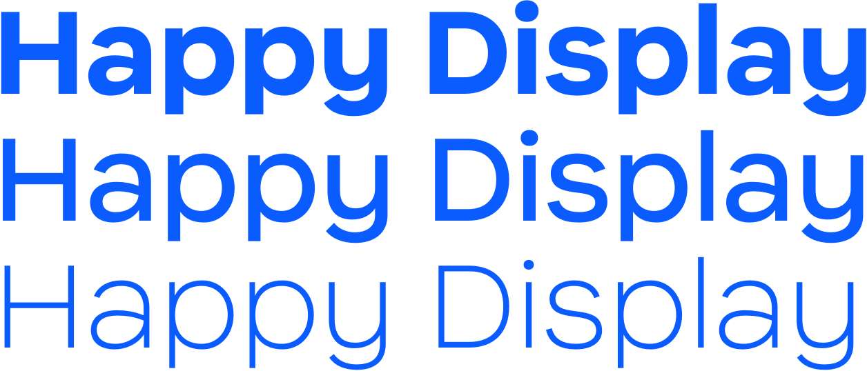
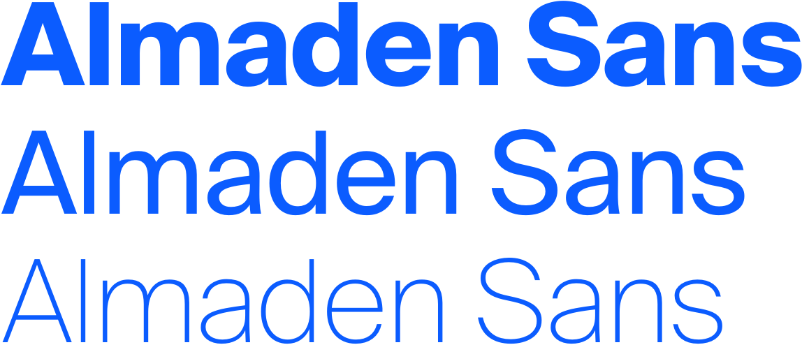
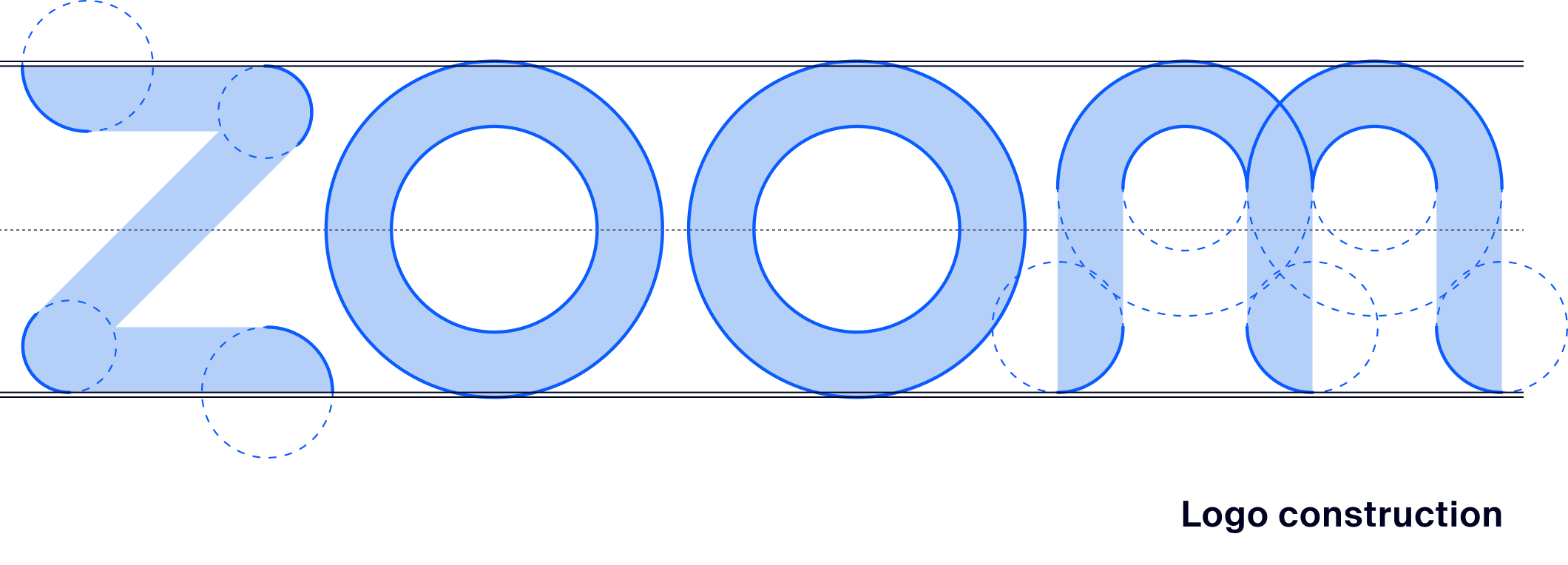
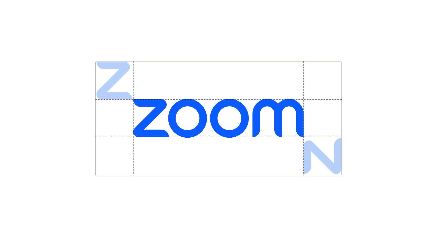
We have retained the unique rounded-tapered ends of the strokes, but have revised each letter form to feel continuously flowing, geometrically constructed, and optically balanced.
Spacing and scale
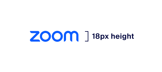
Minimum Size, Digital
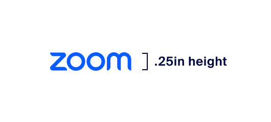
Minimum Size, Print
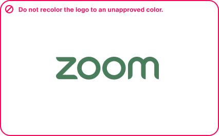
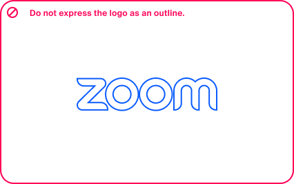
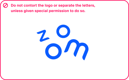
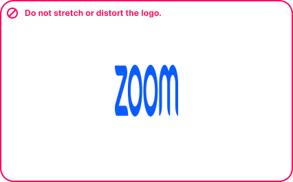
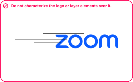
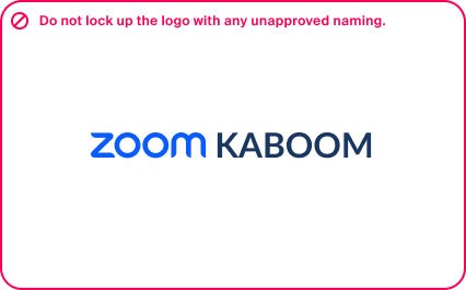
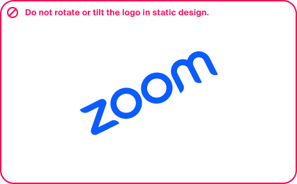
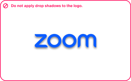
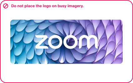
Improper usage
The wordmark was designed with intention, it is important to ensure we are intentional with how we use it. Here are a few examples of incorrect uses of our logo.
Adapting the logo for applications & favicons
The legacy camera icon is no longer approved to use to represent Zoom – it has been reserved for Zoom Meetings only.
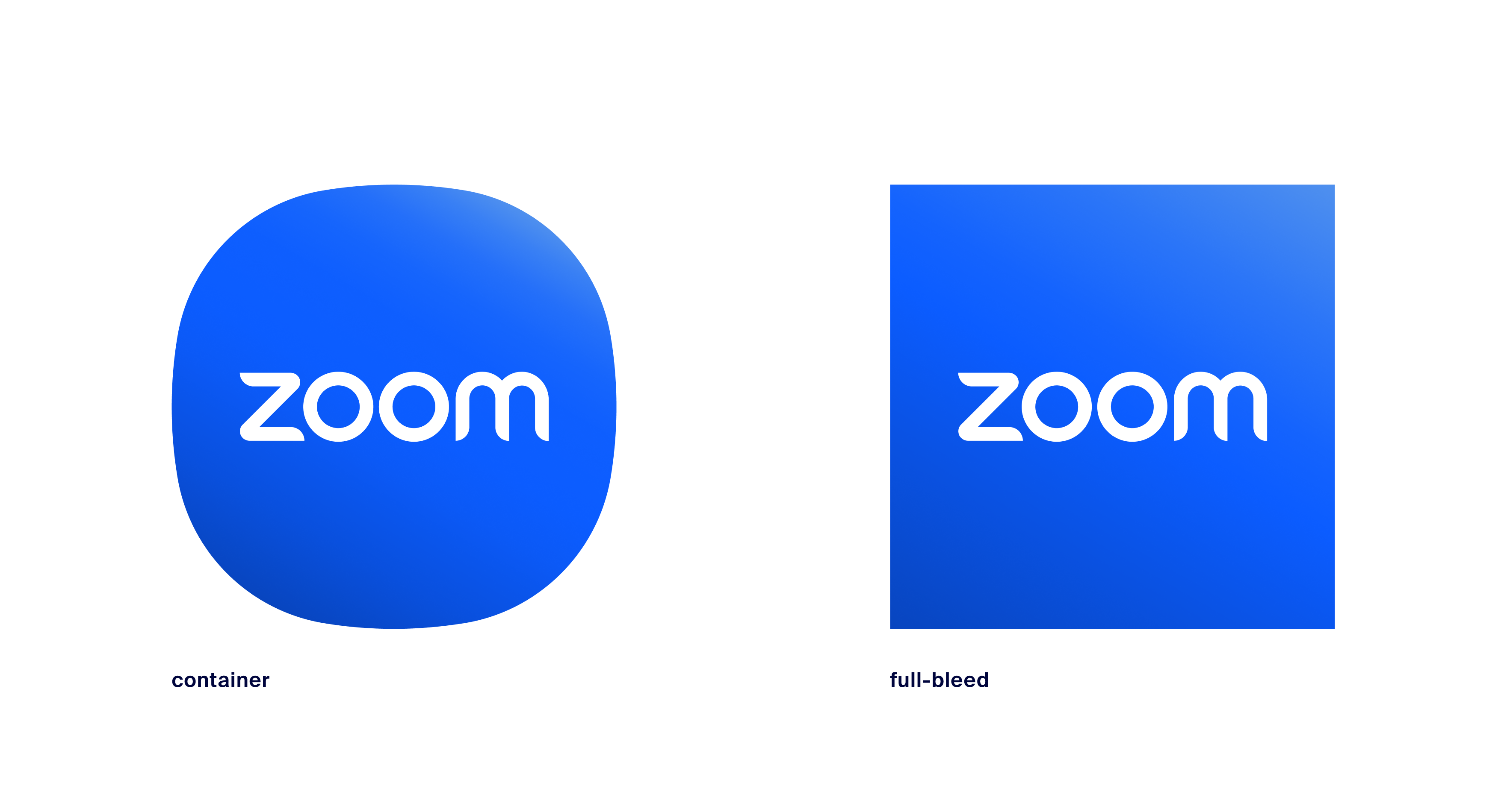
The new Zoom app icon leverages the wordmark against a blue gradient background. The background can either be a full-bleed square for platform-specific clipping, or it can be contained within our centerpiece squircle shape.
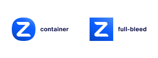
In instances where a micro-sized icon is necessary, an abbreviated “Z” icon is permitted.
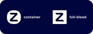
Favicons
Favicons
Minimum Size, Digital